Branding

Campaign

Editorial & Print

GINTIAO

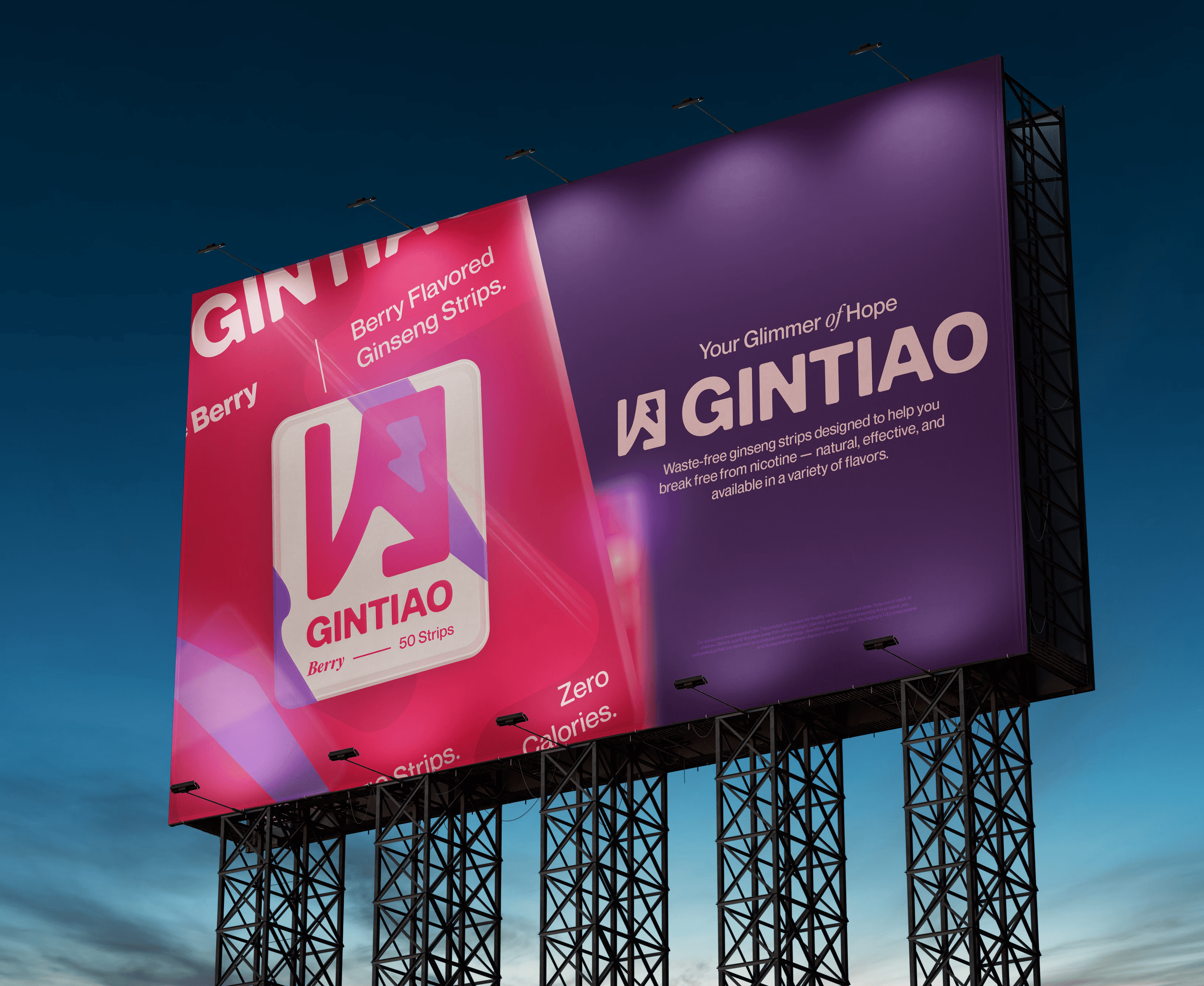
GINTIAO is a ginseng strip product developed through a semester-long branding and marketing project in my Graphic Design course. Our team worked together to plan the product concept, launch strategy, and visual identity.


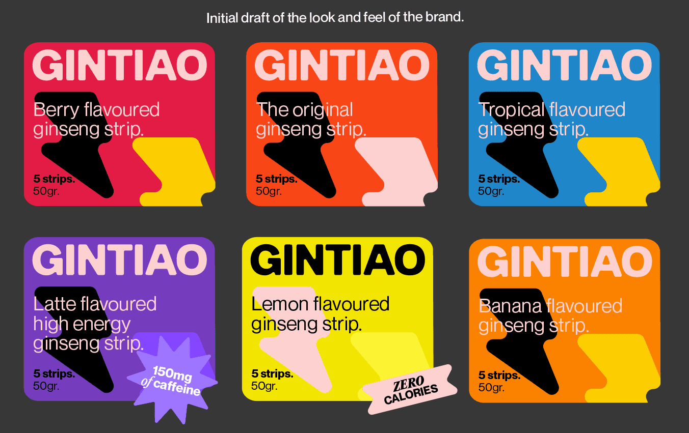
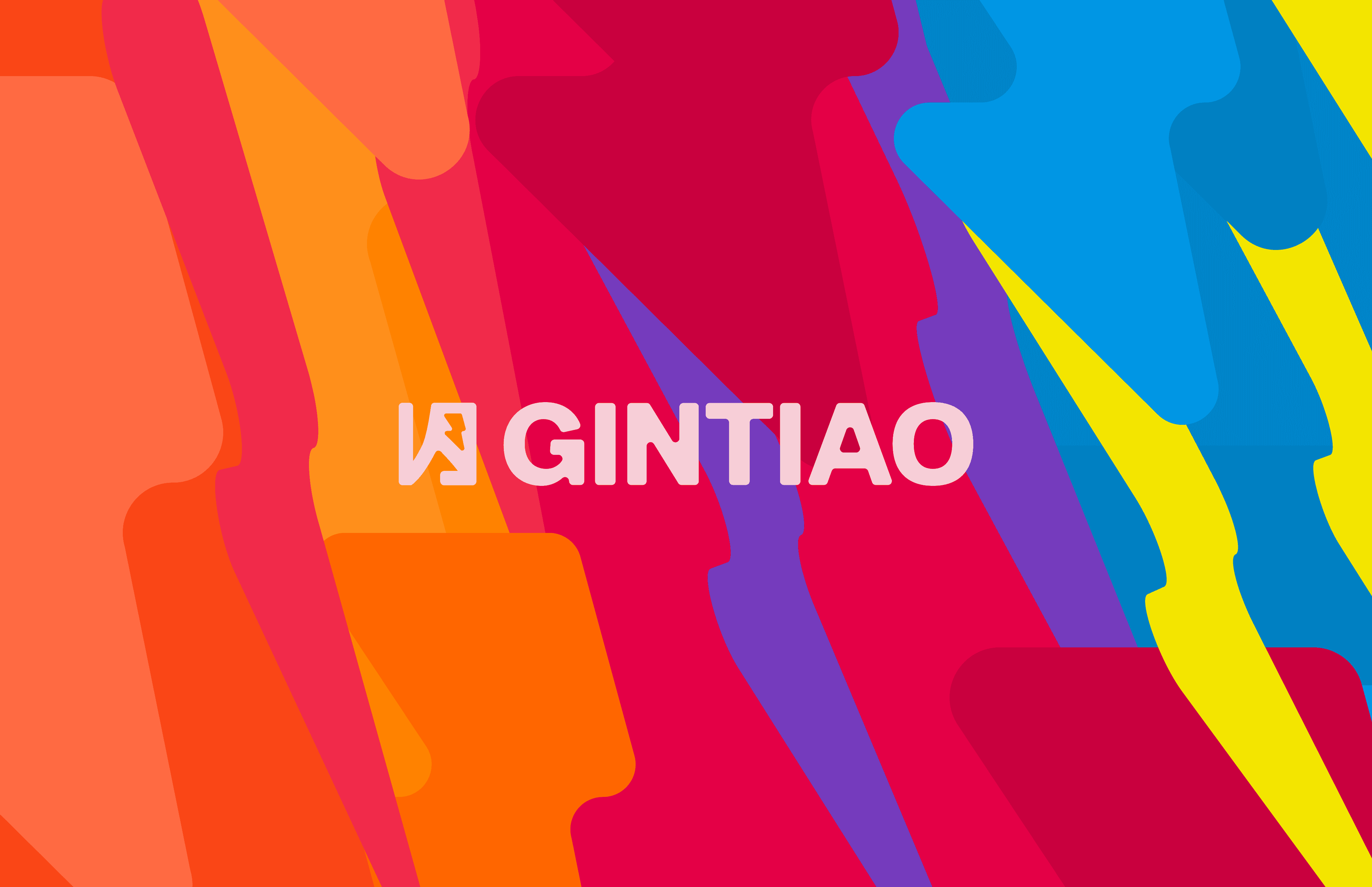
I was responsible for creating the brand’s logo and overall visual direction. The design uses a vibrant, dynamic colour system to distinguish flavours. While the custom logomark adds the modern edge. The identity was designed to fit packaging, advertising, and social media, building a memorable presence for a functional, health-conscious product.

©2025

©2025

Art Direction

·

Branding

·

Motion

·

Marketing

|

Photoshop

·

Illustrator

·

After Effects

·

InDesign

Product Teaser

Video:

I created a short animated launch video for GINTIAO. The animation uses brand’s vibrant visual style through motion, using bright colors, playful transitions.

Making of GINTIAO:

Making of

GINTIAO:

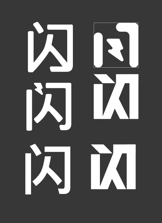
Our first tagline was “The Root of Lightning,” inspired by the power of ginseng. A turning point came when one of my teammates introduced the Chinese word 闪 (Shan), meaning “glimmer.” That idea shifted our direction and eventually led to the final tagline: “Your Glimmer of Hope.”


In the end, the character 闪 (Shan) became the foundation of the GINTIAO logo.

You're viewing a condensed version of this project. Visit from a desktop device to see the full page.

You're viewing a condensed version of this project. Visit from a desktop device to see the full page.